Code
library(rnaturalearth)
library(rnaturalearthdata)
library(ggplot2)
library(plotly)
library(tidyverse)
library(gcookbook)
library(scales)
library(cowplot)
library(maps)
library(dplyr)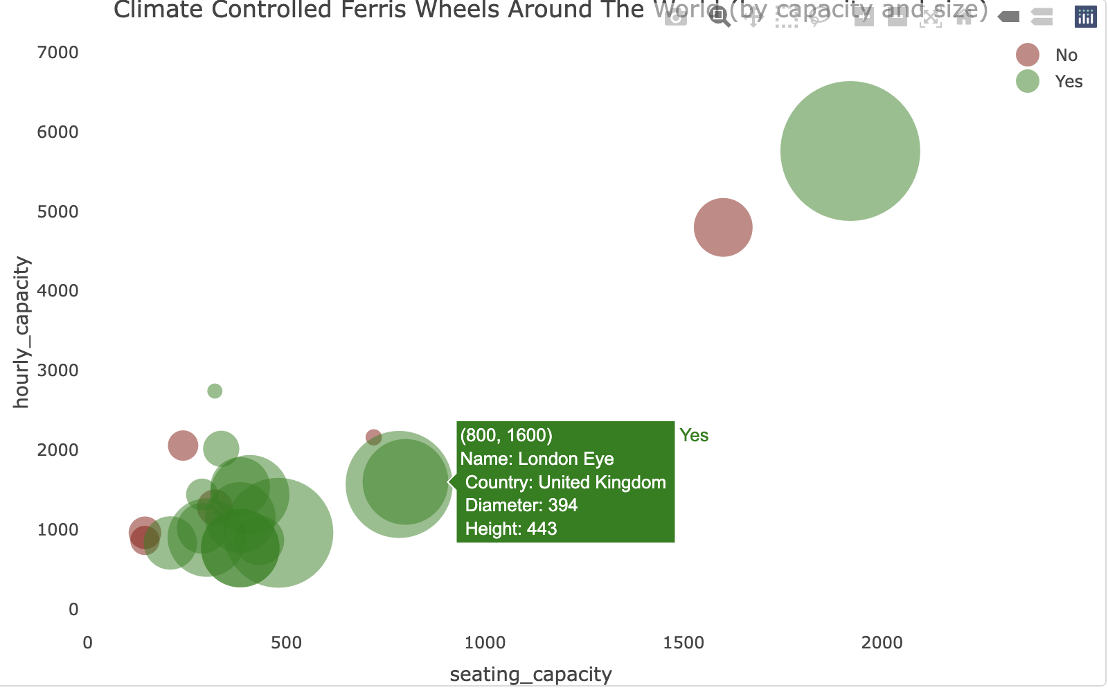
Source: The dataset
To accommodate for large crowds at a state fair, we should expect its ferris wheel to be climate controlled. It seems like most large ferris wheels and/or large capacity ferris wheels tend to be climate controlled. It is interesting, though, that all observable “un-climate-controlled” ferris wheels (5) reside in the U.S. (4) and the U.K (1)
Here are all the libraries I worked with.
library(rnaturalearth)
library(rnaturalearthdata)
library(ggplot2)
library(plotly)
library(tidyverse)
library(gcookbook)
library(scales)
library(cowplot)
library(maps)
library(dplyr)Loading the Data
wheels <- read.csv("wheels.csv")
geo<-read.csv("https://raw.githubusercontent.com/plotly/datasets/master/2014_world_gdp_with_codes.csv")
Cleaning Data
df <- wheels %>%
  mutate(country = case_when(
    country == 'UK' ~ 'United Kingdom',
    country == 'USA' ~ 'United States',
    country == 'Phillippines' ~ 'Philippines',
    country == 'S Korea' ~ 'Korea, South',
    country == 'Tailand' ~ 'Thailand',
    country == 'UAE' ~ 'United Arab Emirates',
    country == 'Dubai' ~ 'United Arab Emirates',
    .default = country
  ),
      climate_controlled = case_when(
    climate_controlled == 'yes' ~ 'Yes',
    .default = climate_controlled
    )) %>%
  drop_na(climate_controlled) %>%
inner_join(geo, by = c('country' = 'COUNTRY')) # Define UI for application that draws a histogram
plot <- plot_ly(df, x = ~seating_capacity, y = ~hourly_capacity, text = ~paste("Name:", name, "<br>","Country:", country,"<br>","Diameter:", diameter, "<br>","Height:", height), type = 'scatter', mode = 'markers', size = ~diameter, color = ~climate_controlled, colors = c('#8B0000','#008000'),
marker = list(opacity = 0.5, sizemode = 'diameter')) %>%
layout(title = "Climate Controlled Ferris Wheels Around The World (by capacity and size)",
xaxis = list(
zerolinecolor = '#ffff',
zerolinewidth = 2,
gridcolor = 'ffff'),
yaxis = list(
zerolinecolor = '#ffff',
zerolinewidth = 2,
gridcolor = 'ffff') )plotWarning: Ignoring 14 observationsWarning: `line.width` does not currently support multiple values.
Warning: `line.width` does not currently support multiple values.